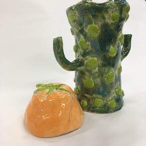
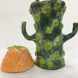
Art Criticism Process1. The art criticism process includes describing, analyzing, interpreting, and judging the artwork. 2. For my sculpture project, I sculpted a cactus. The cactus is a cylinder sculpted object with a halo lid. The cactus is painted a forest green color that has faded turquoise spots. It's the color of a peacock. Throughout the cactus is a repetition of light green circles that lay on top of the cactus. The light green is a lighter value of the color I chose to paint the cactus except no specks of blue. The circles add a bumpy texture to the piece. There are two skinny handles coming off the middle of the cactus that mimic the arms of a real cactus. Towards the top of the cactus, the top face curves outwards a little. The lid is a a half of a circle that widens at the opening. The narrowest part of the lid is the closing and lays a green leaf on top. The emphasis is the lid given is the only part of the cactus that isn't green. At first, the body of the cactus went straight down and didn't hold much shape. To fix this, I added coils of clay to the top of the cactus. Also, my lid broke before it was glazed. To fix this, I glazed the pieces and fired them for a second time. Once they came out of the kiln, I glue the pieces together and taped the close. After a day, I took the tape off and the pieces were stuck together. As I added each coil, I made sure they were scored/slipped towards the outside so they would curve out as you got closer to the top of the cactus. The colors I used are calming like the greens and the light orange. Communicating a story, the cactus shows imagination by turning something realistic into a cartoon version. The mood is calming. There are no bright colors that pop out. For this project, I didn't want to sculpt something fully realistic. I tried adding a fictional touch to the sculpture by adding the light green circles. Overall, I feel this project was successful because it turned out the way I pictured. I loved the colors contrasting in greens. I enjoyed making this project! The light orange pops out in a humble way against the greens. The handles are actually strong enough to hold the cactus by. I like how the project resembles a realistic thing but still holds naive characteristics. It reminds me of something you would see in a cartoon.  3 Additional Questions
0 Comments
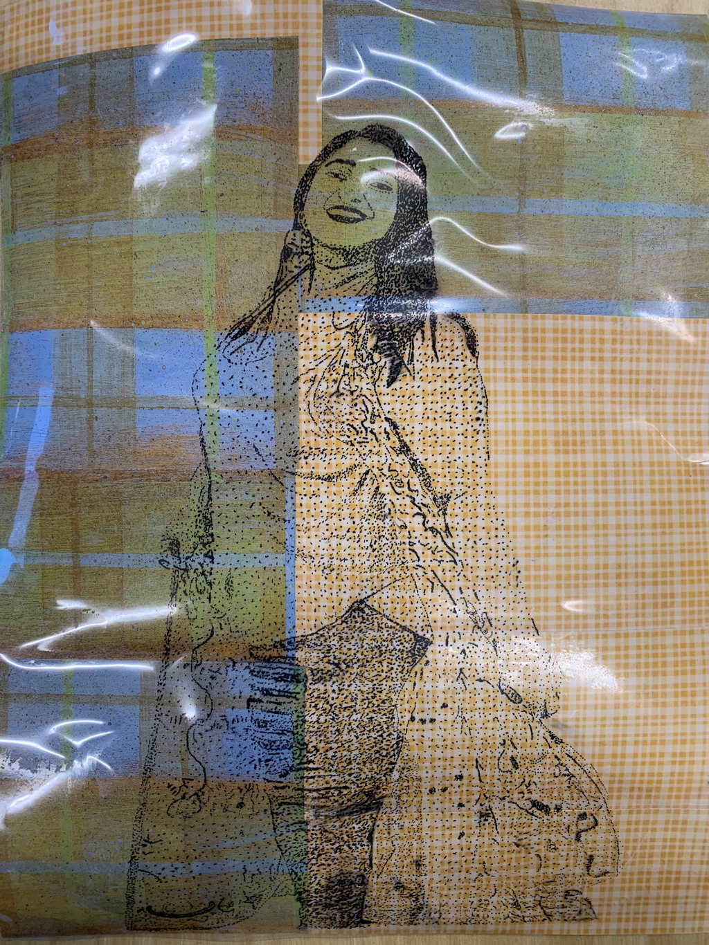
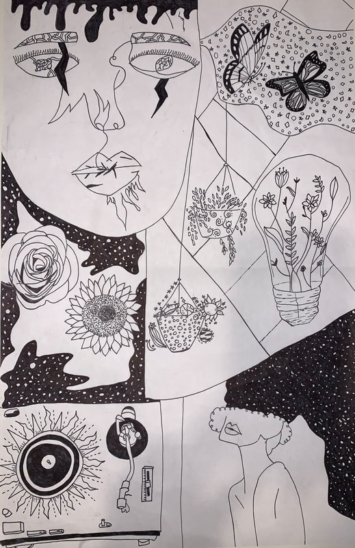 1. My composition was something that worked well in my piece. I feel that the way the drawings filled the paper looked appeasing. There aren't many precise partitions which reveals the piece to be imaginative/free. The aesthetic of the piece is also a pro. Honestly, this is probably my favorite piece I've done so far because of the aesthetic. The aesthetic is imaginative, artsy, and dreamy. The bottom right portion of the piece is my favorite part and I feel its a pro in itself. Black and white color scheme also adds to the aesthetic of the piece . This adds a vintage type feel is some portions of the piece.
2. A con of my piece is that there is no color. Im not sure how it would look with color, but I feel if I added small details of color, the piece would become more attractive. Whether with paint, watercolor, or colored pencils, colored details would add a nice touch. Another con of the piece is the road part near the light bulb. I thought it would be a cool touch, but I feel it makes the piece look flat and plain. 3. The biggest part about the last project for me was finding ideas to draw. I already knew I wanted to do a collage type drawing because I was inspired by one of my friend's artwork. Coming up with the aesthetic and the things I wanted to include took quite a while. To gain inspiration, I looked on Pinterest. The first idea that came to be was the face in the top left portion. I saw some of these types of drawings on Pinterest and decided to one but take my own approach on it. I love butterflies and the dreamy symbol they give so I decided to that. The rose and sunflower are pretty add-ins that would fit the aesthetic. I found a light bulb on Pinterest with flowers and weeds through it which I felt was very pretty. This gave me the idea to add the light bulb and near it, I added buckets. One bucket with space related things and the other with leaves. The record player idea starts doff with me drawing a sun. Then, I found a record player on Pinterest and thought it would be creative to turn the sun into a record player. Lastly, the idea of the girl on the bottom right was given because I knew I wanted to add the story night thoughts coming out of her mind. All of this was done in pencil first. After completing it in pencil, I went over everything with a black sharpie pen and colored some parts in as well.
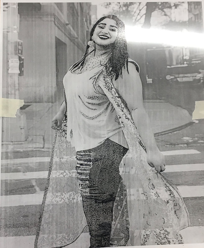
1. My portrait is of my dance teacher, Anu. She is a like a big sister to me that I have grown close to from my 7 years of dancing with her. Before I moved to NC this year, I always looked forward to going to dance because of her. She isa person who I could go to talk to for anything.
2. I used pen for my portrait with the technique of stippling. I stippled on a transparent piece and glued plaid papers beneath it. 3. First, I printed out a black and white picture. I used the transparent piece and taped it over the picture. I stippled over the portrait with a black sharpie pen. The darker shades in the picture is where I stippled the dots closer to each other and for the lighter areas, I kept more space between each dot. After the portrait was completely stipples, I sprayed a finish so that the dots didn't smear over each other. Lastly, I glued plaid paper under the stippled piece. 4. For some parts of the portrait, I wasn't careful with where I put my hands so some dots smeared. I also wish I chose different paper for the background or thought of something more creative. I like the picture I chose to use and I feel that the dots were well done throughout most of the piece.
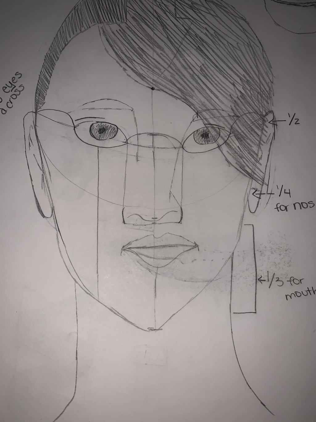
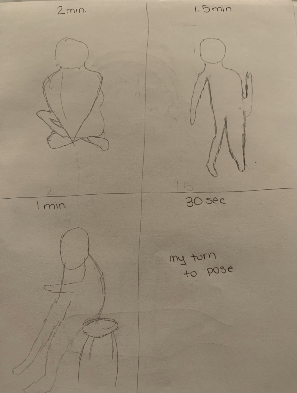
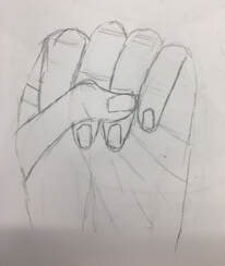
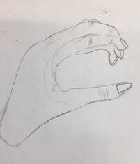
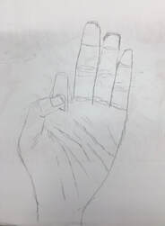
1. The gesture drawings were the most helpful in my portrait piece. Given my portrait, was mostly focused on a body, this warm-up helped me become comfortable with drawing different body gestures. The way my dance teacher was posing was not in a regular stance so these warm-ups helped me pay attention to the details in the way she posed.
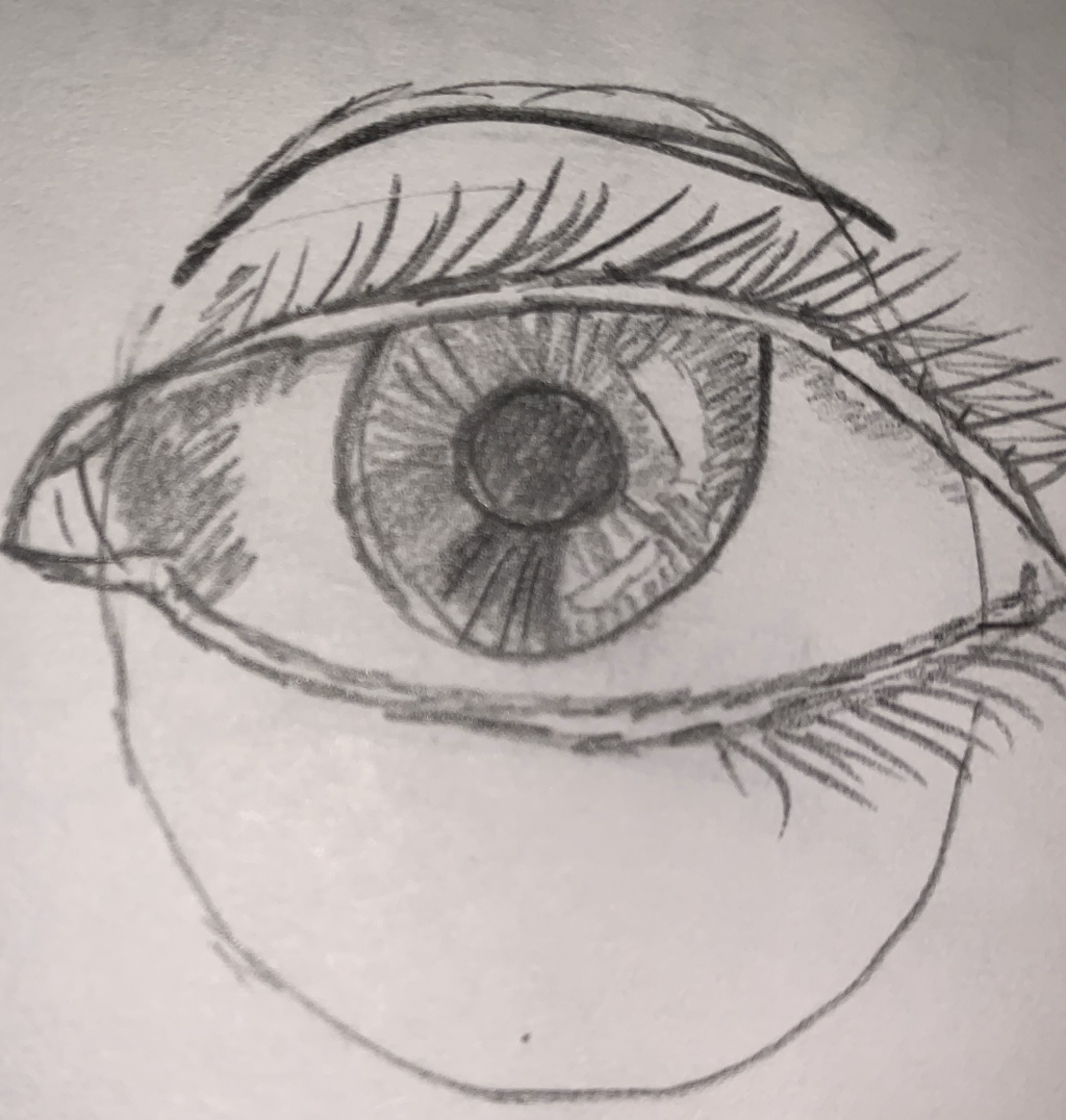
2. I found most surprising that there are many measurement needed to be made out for the face proportions. I didn't realize that drawing a portrait took measuring out the space from the top of the head to the middle of the head or the space between the eyes and nose. Overall, I just found surprising how much planning and detailing drawing a portrait needs to be done properly/successfully.
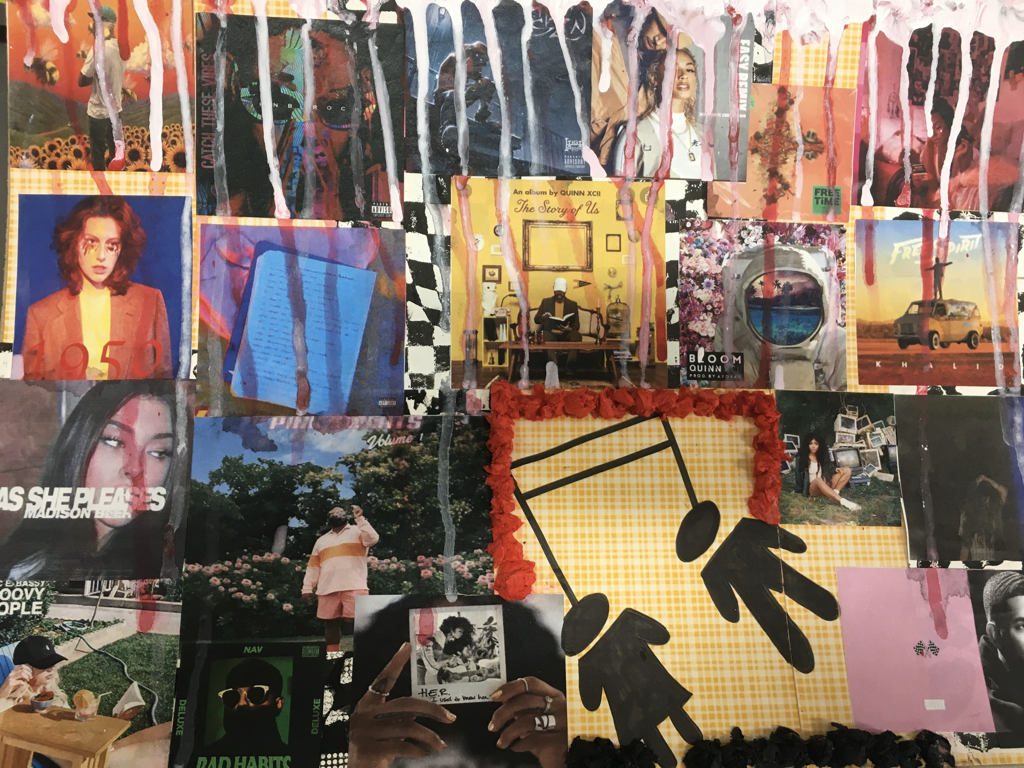
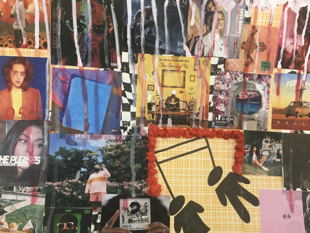
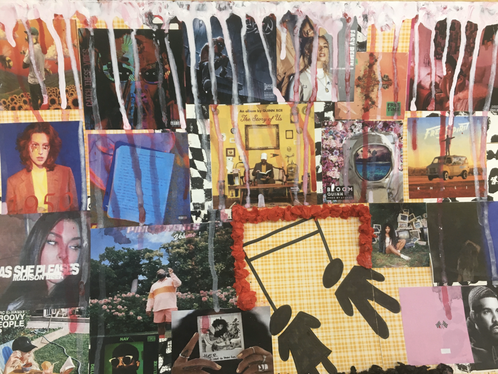
1. The first item I used was a piece of cardboard which I used as the base of my project. On top of the cardboard, I added piece of decorative paper using glue. One sheet was a yellow plaid print and the other sheet was a black/white checkered print. Searching for my favorite music albums and songs, I printed each of them out and attached them on top of the decorative paper. Using a Sharpie, I drew a music note with two people connected. Surrounding the music note, I created a border of tissue paper using red and black tissue paper. Lastly, I used acrylic paint to created drips falling towards the bottom of of the piece. Overall, I used 6 different mediums/techniques in my piece.
2. My word was 'understood'. For me, one of my favorite things to do is listen to music. When I'm feeling any emotion, music is the way to let it out which help me feel understood. I also am a dancer so music is just a way for me to let out emotions in a way that also helps me understand what those are. In-Progress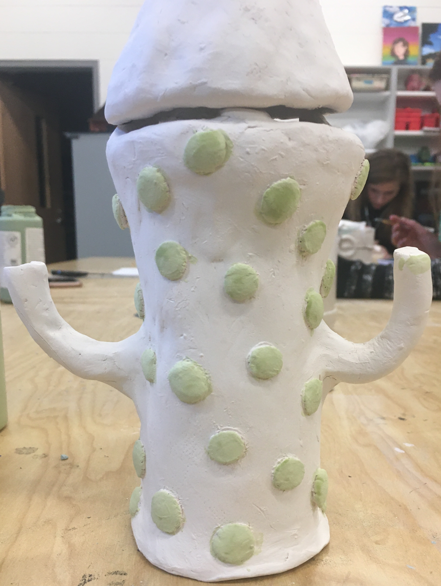 1. To finish, my piece, I plan on glazing it with colors that enhance what the object is. A cactus is green so I plan on painting my piece using different shades of green. For the lid, I plan on glazing it with a accent color so it different from the cactus. I was thinking of glazing it with a pink or gold. 2. I found making the lid difficult so far into the project. It was hard to sculpt so that it fits nicely on top of my piece. I still think the lid could fit more nicely. I feel that if I found a different way to make the lid then it might have been more successful when attaching to the top of the piece. I also found it difficult attaching the handles of the cactus in a way where it would stay on firmly. 3. I feel that the body of the cactus is successful so far. The body looks as a cactus would so I feel that is pretty successful. The circles on the piece make it appear more as a cactus which added a pretty touch as well. 4. I started off by creating a cylinder fior the base using a slab and a cylinder stencil. Then, I added coils on top of the cylinder to make it wider towards the top of the body. I created the handles and scored and slipped them to the side of the piece. I added the circles to the body of the cactus and made the lid by sculpting a pinch pot. To attach the lid, added coils to the inside so it fit tightly on top of the piece. Finished
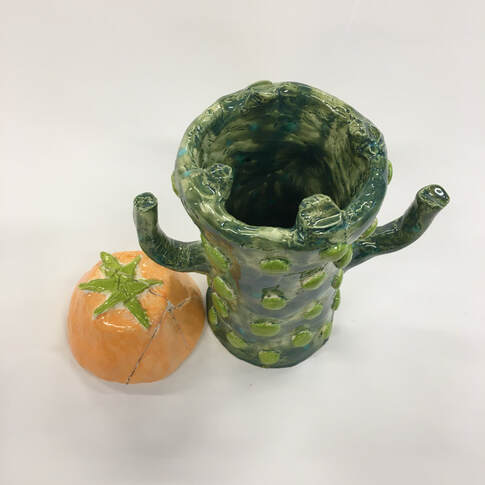 1. Since my in-progress post, I have glazed my piece and put into back into the kiln to be fired and finished. The glazing consisted of 2-3 coats per each color. Also, the lid of my piece broke so I also had to glue the pieces back together after it was fired for the second time.
2. I find successful the shape of the cactus. I feel I did a good job of shaping it to look like a mini cactus and adding stone handles as well. I also like the light green polka dots on the cactus which enhances its appearance. 3. If I were to do it again, I would definitely change the colors of glaze I chose to use. Instead of the bright orange, I would choose a baby pink and instead of the peacock green, I would chose a solid green color.
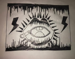
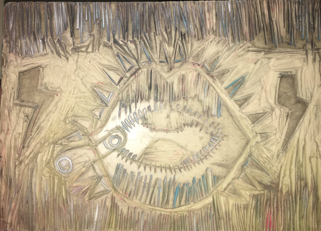
Finished Best print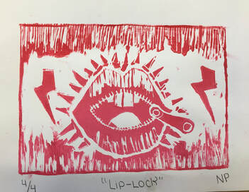 1. My piece shows the theme of "line" by the detailing on the top and bottom of the block. The detailing of scattered lines leaning towards the middle of the block uses the theme of "line" to gives the block a unique composition. Also, the theme of "line" is incorporated into the lip detailing near the zipper and towards the upper/lower part of the lip. The triangles also embrace the theme of "line"s surrounding the outside of the lip.
2. My piece was successful because of its composition. This piece contains a lot of detailing using lines which make the piece more visually appealing. For example, in the empty white areas near the edges of the block were filled with the scattered lines. I also added the lighting bolts to the sides of the block which filled in more empty space. If I were to do the project again, I would make sure that the lighting bolts were facing the right way once printed on the paper and find a way to make the lip look more clean. I would probably get rid of the line details on the lip and instead make it solid so it'd look cleaner. 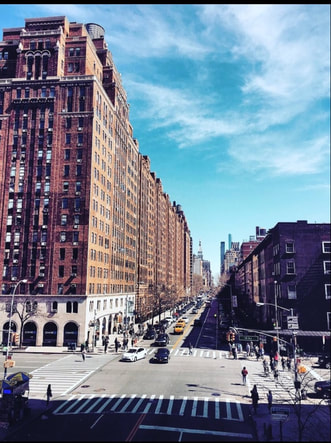 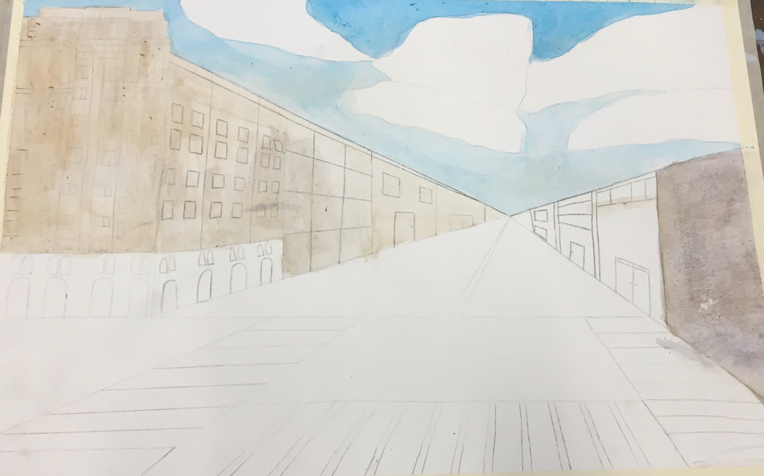 
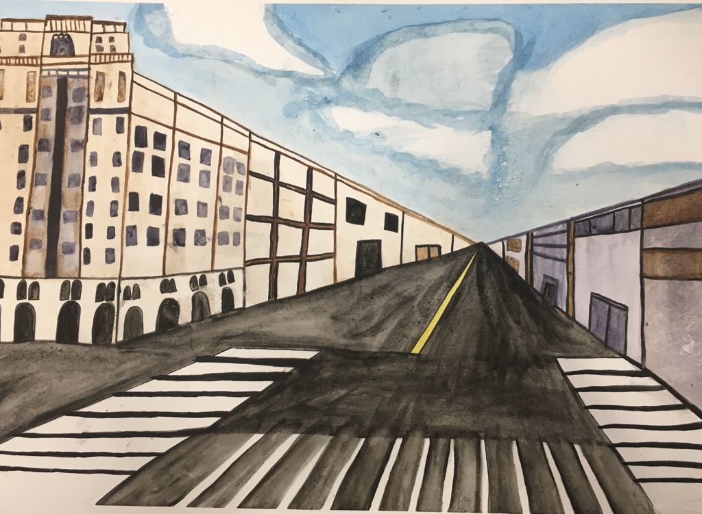
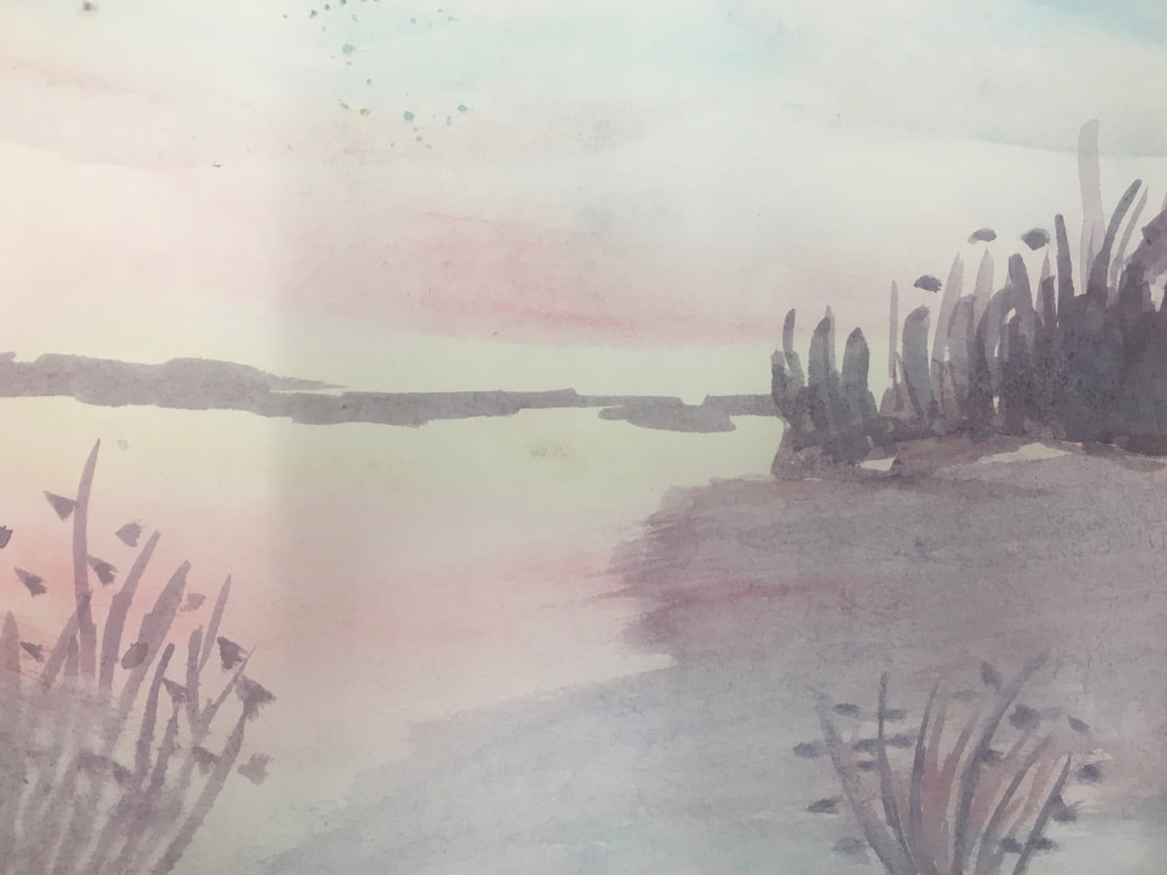
1. For my watercolor final, I used first point perspective. There is only one vanishing point demonstrated in the painting as well as in the original photo.
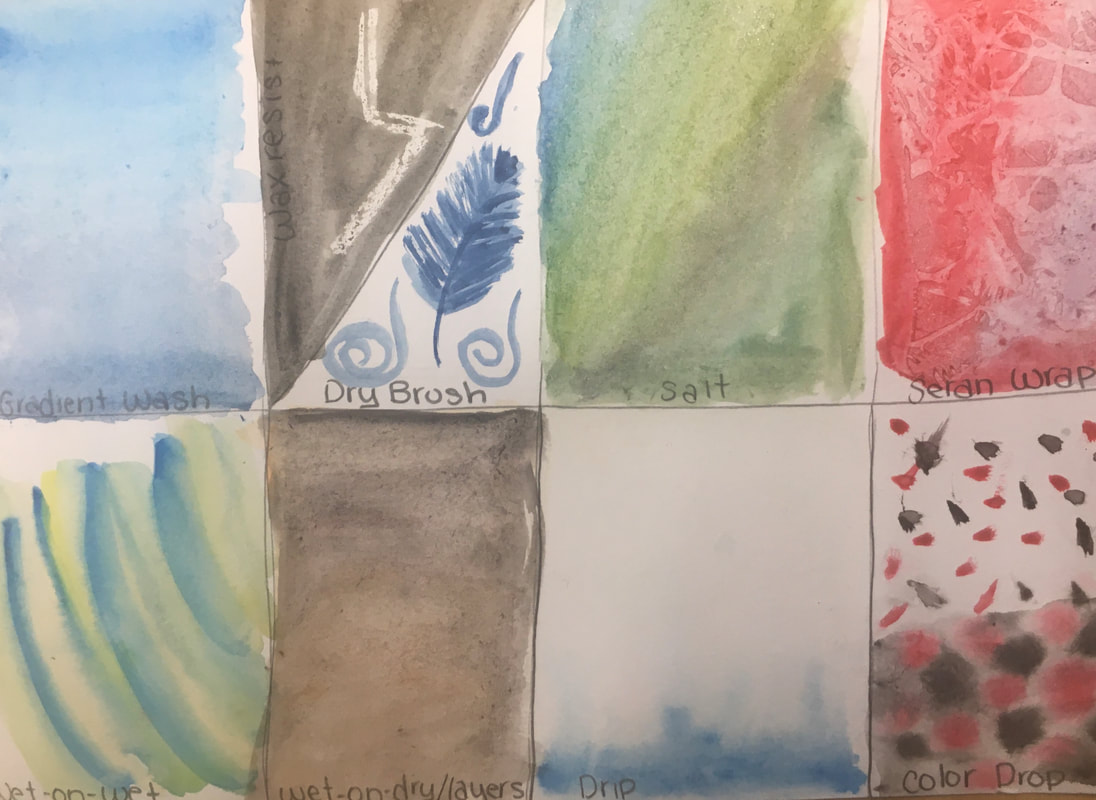
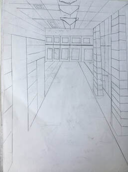
2. I took the photo in New York City. The picture was taken on the high line which is why it looks like its been taken from a high platform. The high line is above NYC and is a place to walk across the city. The view is beautiful from the high line. 3. I found it difficult with making precise/sharp lines with watercolor. For example, it was difficult to make the straight lines for the windows, doors, or the sides of buildings with watercolor. Another thing that I found hard to do was to draw the buildings and the detailing in the buildings. Each horizontal line had to meet the vanishing point which became frustrating for every single window/door or other details. 4. The watercolor techniques was the most helpful watercolor warmup to me. It allowed me to get comfortable with the different ways to use a brush when working with watercolor. Also, if I wanted to incorporate variation into my painting, the different techniques helped me to do so. In my painting, I included dry brush, gradient, and wet on dry to mimic different effects that were in the original photo. The hallway drawing was the most helpful perspective warmup. It gave me realistic practice with how to turn a real place into a perspective drawing on paper. The hallway drawing was in first point perspective so it gave me an idea of how to drawn the picture I chose in a similar way.
1. I found the sunset the most interesting to learn the process of. The sunset seems so difficult to create but the steps helped make the process easier. For example, we started by adding blue, red and yellow to the entire piece of paper very lightly. With that as the base, we then began layering details on top which made the final piece cohesive.
2. I like how easily watercolor is to blend and how you layer details as you move further along. Blending with acrylic wasn't possible and I struggled with making the colors not look choppy with acrylic. Watercolor gives the option of blending colors on paper. This made it easier to make the colors look smoother. I also liked how quickly watercolor dries making layering details more efficient. 3. With watercolor, it was difficult for a color to come out dark on paper. The only way to get a super dark color is by using dry brush which sometimes didn't look cohesive with the wet/smooth colors around it. It was also difficult to mimic small/intricate details. Working on my final piece especially, the windows/doors/other details were frustrating to do with watercolor. With acrylic, it was definitely easier to create small details as compared to using watercolor. |