|
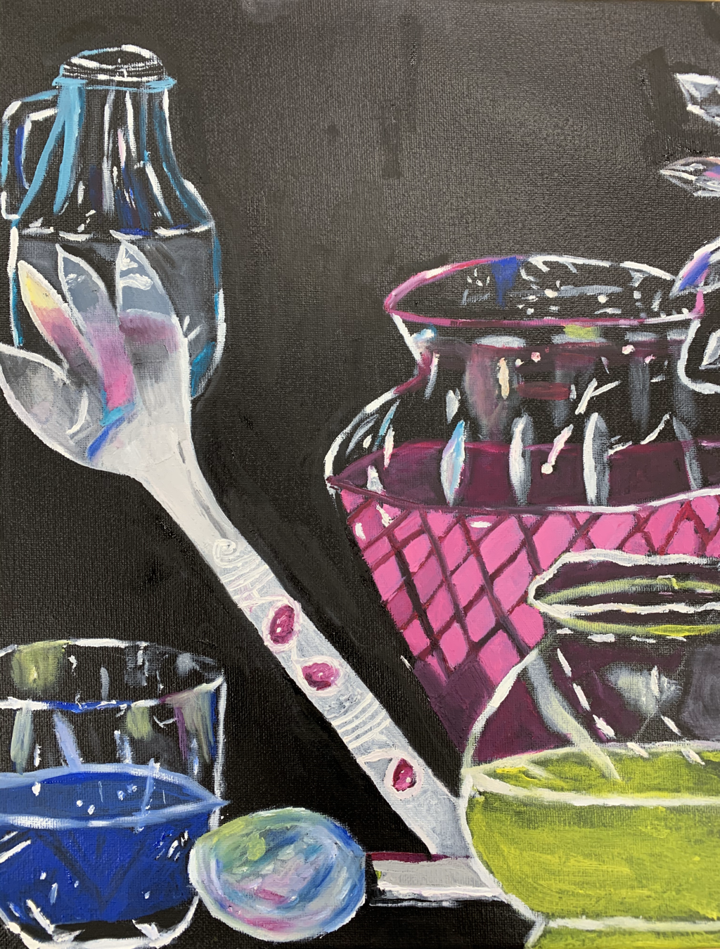
3. The project where I felt the least successful was the glass painting. I feel that this project was rushed for me. Instead of my time with each reflection and highlight, I estimated the strokes. When sketching onto the canvas the composition of the glasses, not all of the parts matched to way they were in the picture. Some glasses were closer to together when they weren't supposed to be. Some glasses were shaped differently than they were in the picture. Given of these differences in the painting, some proportion were off as a result. I also feel that I didn't take the glass practice seriously. If I did take the practice seriously and took more time on it, I feel I would've been more comfortable with painting the glass. If I were to do something differently, I would definitely take more time with the practice and the painting. Also, I would try to mimic every detail in the picture onto the painting even if the detail is very tiny. I feel I went wrong with the piece when I estimated the details instead of actually following the picture correctly.
|
|
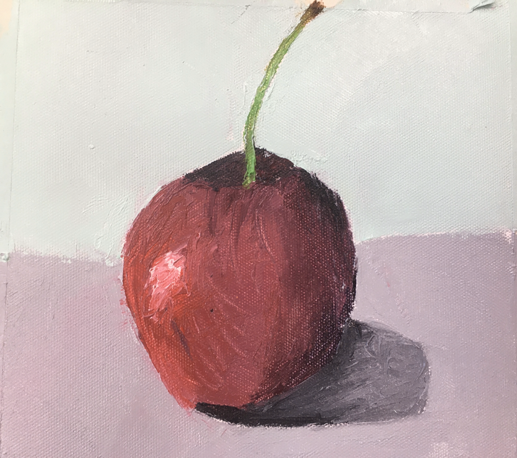
7. My favorite medium to work with this semester was oil paint. I have never worked with oil paints until this semester. Even though the medium was very messy and got everywhere somehow, it was an easy medium to blend. Shown in my previous paintings like the Hundertwasser painting, it was difficult for me to blend successfully. With oil paint, it was easier for me to blend colors and I learned how to pick colors to blend that would go well with each other. For my choice project, I feel that I became comfortable with blending oils. The galaxy background was done in oils and it looks pretty cool. I learned many techniques with this medium. One technique I had fun doing was using the palette knife. Between the two the oil practices with fruits, the cherry that I painted with the palette knife came out better. The texture was still evident with the palette knife yet the colors seemed more cohesive than they did with just a regular paintbrush. Also, with oil paint I practiced an animal eye and feathers. The oil paint allowed made it easier to blend different values between the feathers. This made the feathers appear more realistic. For my wolf painting, the eye was done with oil paint. The eye was the most realistic part of the wolf. There was a royal blue and a darker value of the blue as the shadow. There was white highlights in the eye and black to shape the pupil.
|
|
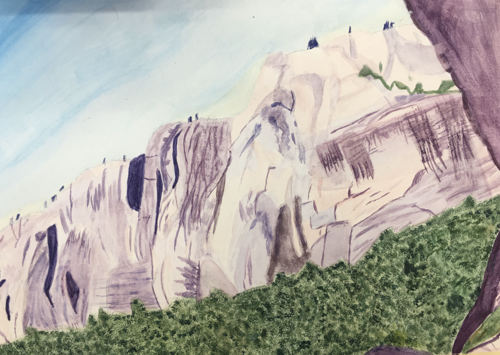
1. My portfolio is an accurate representation of my development in the class. Overall, I feel that my work improved throughout the course of the class. Starting with the watercolor mountains, this painting didn't hold much complexity. There wasn't much detail or technique evident in the watercolor. I did use dry brush and wet on wet throughout the painting. The next painting was the Hundertwasser painting. This painting held more details with the sun and moon's facial features. There were also a larger variety of colors and color schemes(cool colors and warm colors). After this painting was the landscape painting. For this painting, improvement with blending was evident. I was able to successfully blend the values of pink into the sky, blues and whites into the bushes, purples and tan into mountains and etc. The transition between the colors weren't completely smooth but they were close to it. The next painting was the animal portrait. This painting was where I became better at blending and accurate with realistic details. The tongue, teeth and eyes of the wolf were very close to how they were in the picture. The values in each feature were almost exactly the same as they were in the photo. My ability of blending colors to create realistic features improved. The glass painting was the next painting I worked on. This painting is an odd reflection of my work. I don't think this painting expresses my growth throughout the class. Working on this, it was a way to try something new and I wasn't quite good at it. The glasses didn't look realistic as I hoped they would. For my final project, I feel that blending colors was becoming easy to me. The background looks realistic as a galaxy and I was happy with the colors I chose to accomplish the look. Not satisfied with the astronaut, it appears cartoonish instead of realistic. My lines became straighter however compared to the zig-zags they used to have before.
|
|
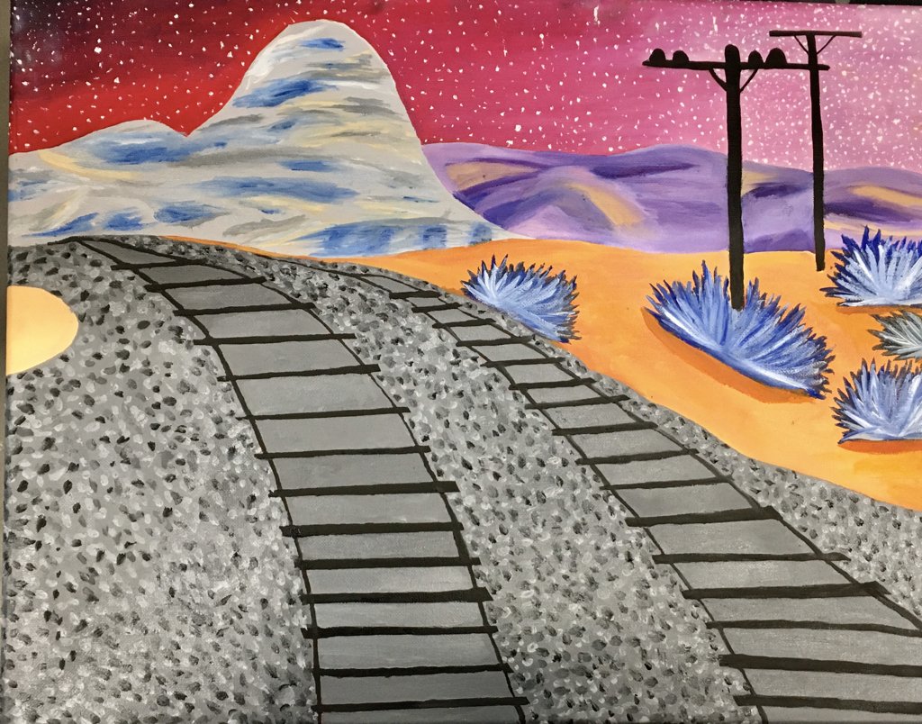
2. I describe my artistic style as imaginative and fictional. I feel I am better at painting things that are not real. Although my wolf painting is my favorite painting of mine, I feel my style as an artist is painting things that aren't real. For example, the landscape painting was a place that is real but was painted as somewhere fictional. The sky was pink instead of value. The bushed were blue and white. The mountains were purple and gray. I define success as an artist as someone who uses art to make someone feel some way when they are looking at it. The most important skills I draw upon to make my artwork is blending of colors, composition, and choice of colors. The most important skills I take from painting is composition and colors. Painting allowed me to challenge my skills with composition. I learned how important composition is to an art piece and why it does to someone looking at you artwork. I also learned how colors are very important to a painting. Colors are the first thing to capture someone's attention.
|
