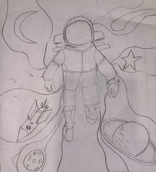
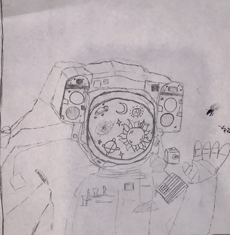
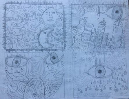
Sketches
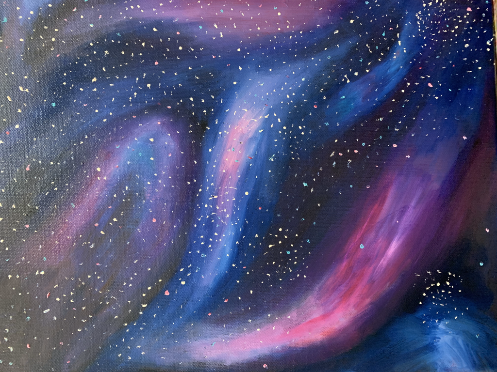
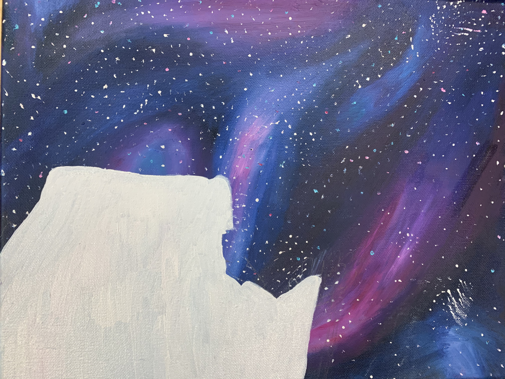
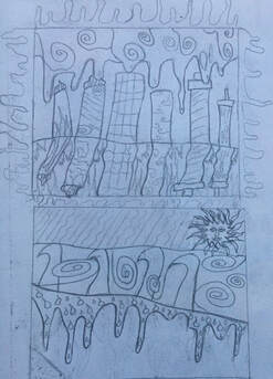
In- Progress Photos
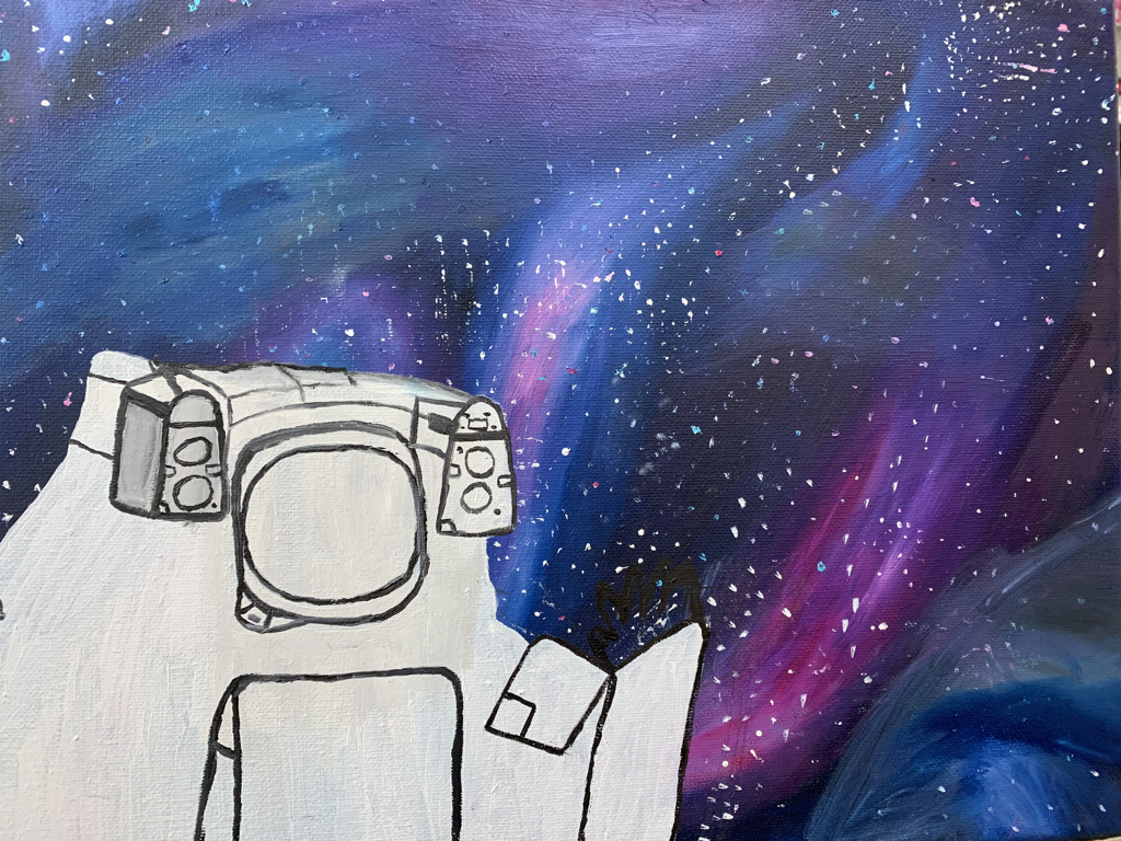
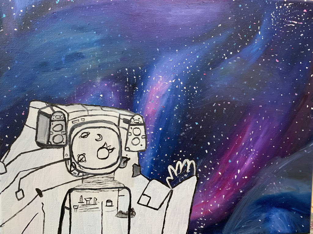
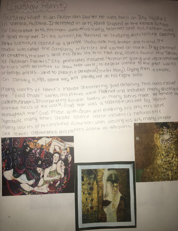
Final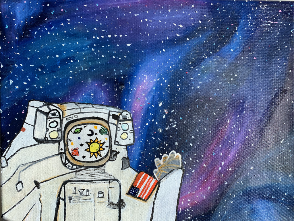 1. The biggest success with this painting is the background. I feel the background gives the exact representation that I was hoping it would do. The background is suppose to be a galaxy. I used navy blue, pink, purple, white, and teal to create the galaxy effect. At first, I couldn't fine a way to blend the colors in a way where they would appear cohesive. After taking liquid as I took some paint, the colors became easier to bond together. Another success are the colors. The colors in the background are very pretty together. They are mostly all cool colors. The pink adds a great touch to the background. The pop of white with the astronaut stands out against the cool/dark background.
2. Overall, I feel that my composition was successful compared to the ideas I had before. My first idea was with the astronaut in the center and all of the planets coming off of him in bubbles. The sketch was simple, bland and boring. Compared to my first sketch idea, I think the composition of my final is successful. The astronaut is closeup and waving while the planets are see through his helmet. 3. The process of this piece was stressful. More than any of our previous pieces, I felt that this piece held the most time constraint and pressure given it was the final piece of the semester. The time was very limited after finishing my glass painting. It took long to come up with an idea for my final project and that left me not much time to paint the actual piece. After throwing ideas into the air, I realized I wanted to do something space related. My first idea was an astronaut in the middle of the canvas with space related thing coming off of him. The composition of this idea was simple and bland so I tried sketching a new idea. I sketched a close-up astronaut waving with space related things reflected through his helmet. For the background, I cam up with doing a galaxy given I thought it would be the ideal background to go with my theme. After priming the canvas with red acrylic paint, I began painting the galaxy. I used blue, teal, pink, purple, and white to create the galaxy. It took a while to fully blend the color together the way I wanted but the liquid definitely helped. Then, I began sketching the astronaut and then painted over it. The astronaut took a while in order to mimic the tiny details. I needed to borrow a friend's paintbrush so it would be tiny enough replicate the details. 4. There were many difficulties that I encountered with this painting. One difficulty that I encountered was painting the astronaut. After finishing the background, I tried sketching out the astronaut onto the canvas but kept messing up. The background wasn't completely dried yet, so when I tried erasing the pencil lines, the background became a mess. To fix this issue, I painted the area where the astronaut was going to be white. Another difficulty I ran into were the details of the astronaut. I used a friend's paintbrush because I didn't have tiny ones that would work for the details. However, I still struggled with matching the details to the way they were in my sketch. I still don't think the details match up with how I wanted them to be but they don't look that bad. 5. As a whole, I think my craftsmanship was ok with this project. I feel that the time constraint made me rush throughout the painting. I also feel that I wanted this to be my best painting but ended up messing up with it. I don't think the painting looks terrible, I just feel that there could be a good amount of improvement. For example, I wish the astronaut looked more realistic and detailed as it does in the sketchbook. For the background, I feel it looked better before adding the specks of white. Some white specks smudged because I wasn't being careful with it.
0 Comments
Original Photo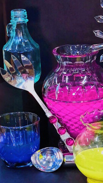 Sketches
Practice In progress Pictures
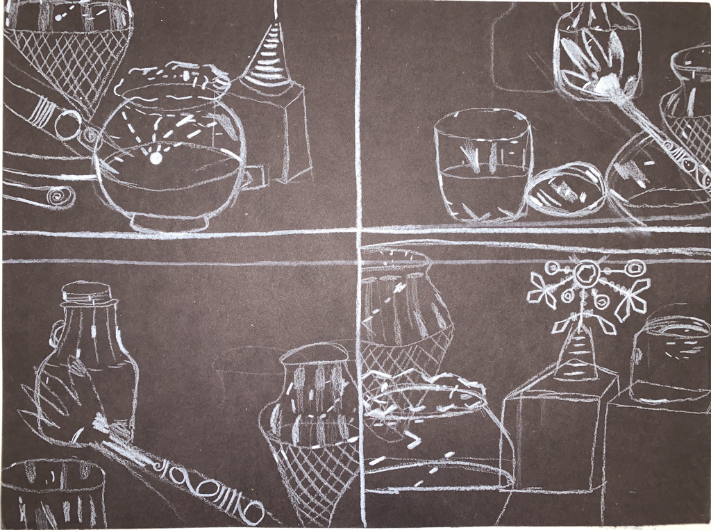
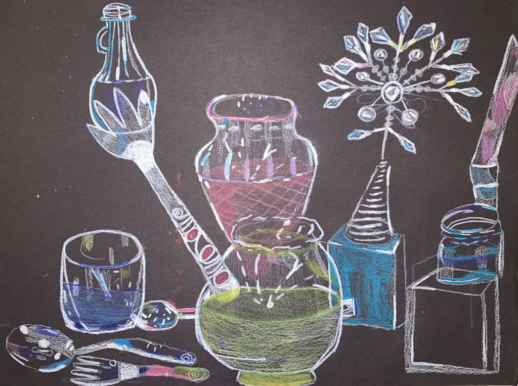
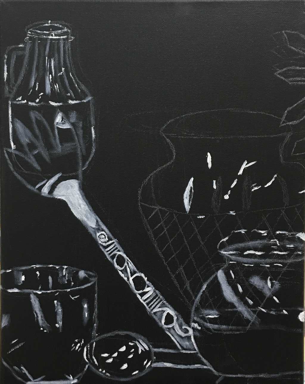
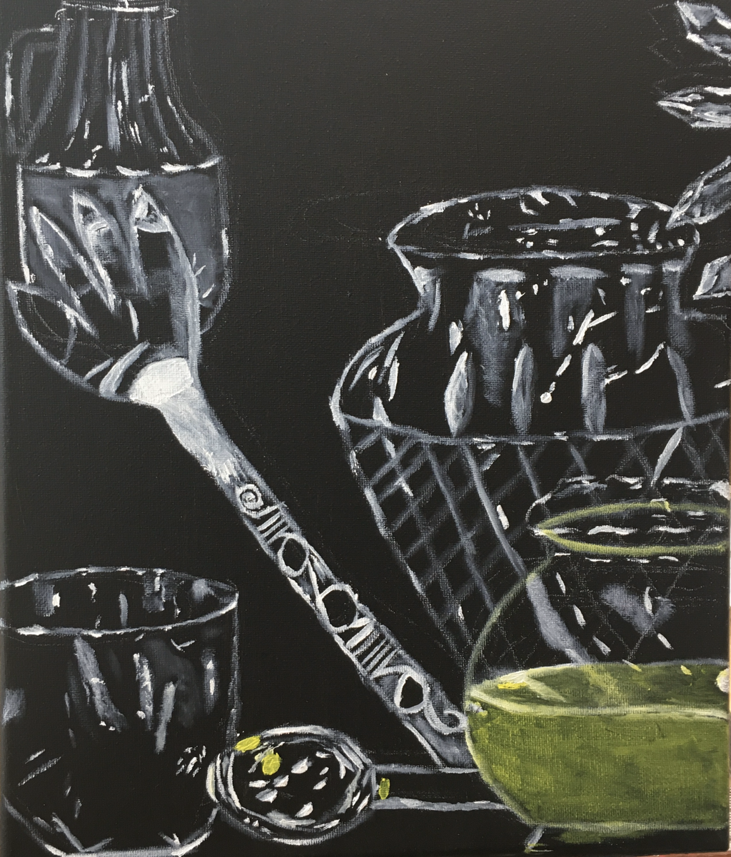
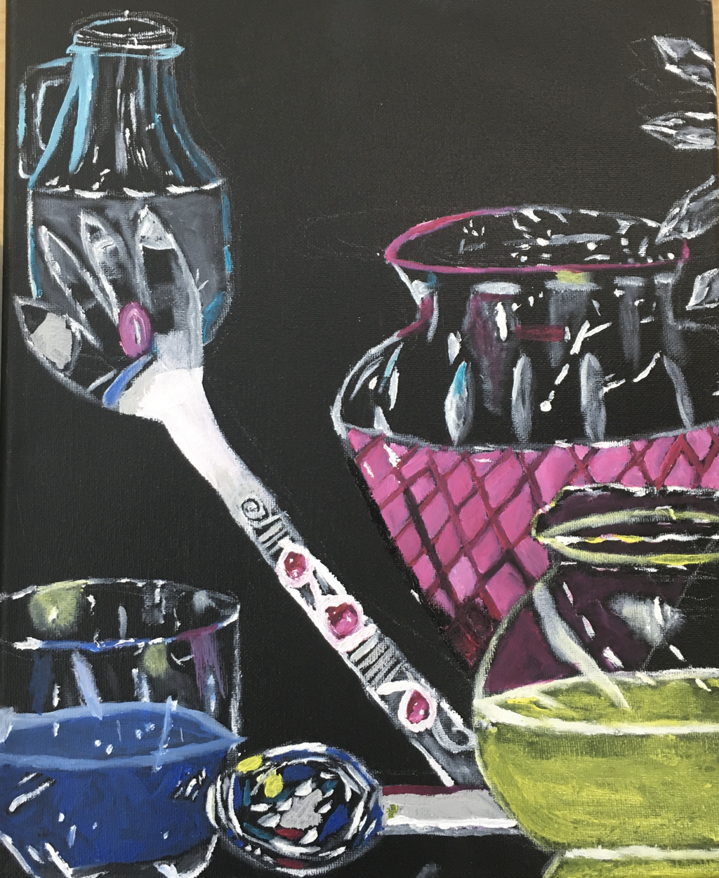
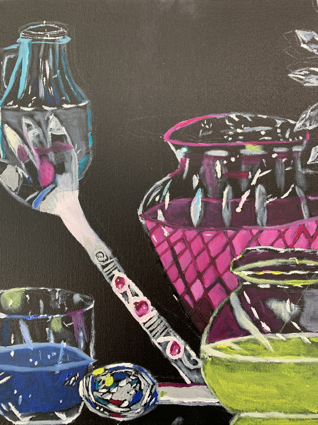
Final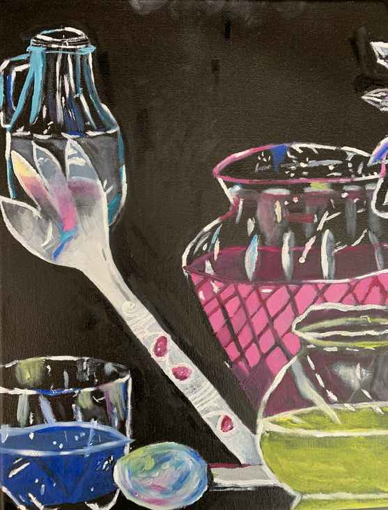 1. The process of making this glass painting took many steps that needed to be done in order. Before putting anything on the canvas, I primed the canvas with black acrylic paint. To plan the composition of the piece and where each object was going to go, I used a white colored pencil to draw everything out. After drawing it out, I used white oil paint to replicate the reflections in the original photos. The white was also used in areas that had any highlights or lighter shades such as grey. Using colors replicated in the original picture, I painted them in the canvas where they were shown to be in the photo.
2. I think I could have done better with this painting. The painting looks cartoonish to me instead of realistic. What I could have done to make the painting look realistic is make the detailing more precise. Some highlights and colors were were put in some areas where they weren't evident in the picture. Some highlights and colors also were't painted as proportionate as they were in the real photo. After blending the colors into the spoon and the fork, I realized that it looked more real before blended. Also, I feel I rushed the process of this painting so I could finish it quicker. If I took my time to paint each detail, I feel the painting would've look better. 3. One difficultly I found with this project was figuring out the composition of the objects on the canvas. I was difficult to draw the objects enlarged on the canvas and still keep their position accurately. Sketching on the canvas took longer than painting the actual glasses for me. I also found it difficult when adding different colors into each of the glasses. For example, It was difficult to create the effect that the pink, yellow, and blue were a reflection in the fork and not actually apart of the fork. This was also a difficulty I faced when painting the head of the spoon. 4. I think my craftsmanship was good for this painting. It wasn't great and could have been much better, but it was not bad either. I struggled with trying to make the glasses look realistic as they were in the picture. I could have improved with the brushstrokes of the reflections and different values of white. However, my skill did improve as I progressed through the painting. From the way my practice looked to the final painting, I feel my skill did improve with blending the colors to the white values. Overall, I feel I did an okay job with this painting. 5. Creating highlights and shadows was crucial to make this painting successful. In order to create highlights, I used values of white and bright values of the other colors. In order to create shadow, I used black or darker values of the other colors. For some parts of the glasses, there are glares. To paint the glares and make them noticeable on the canvas, I blended white which created a ashy color as the glare.
In-progress photos
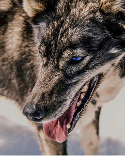
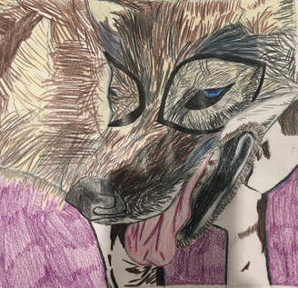
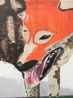
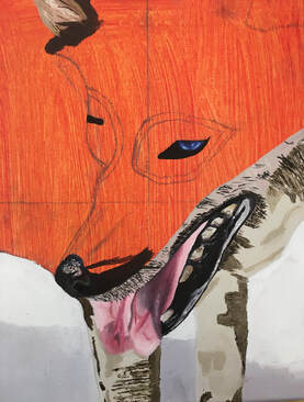
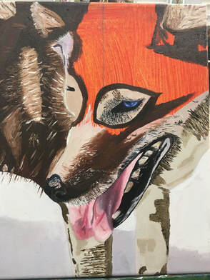
Final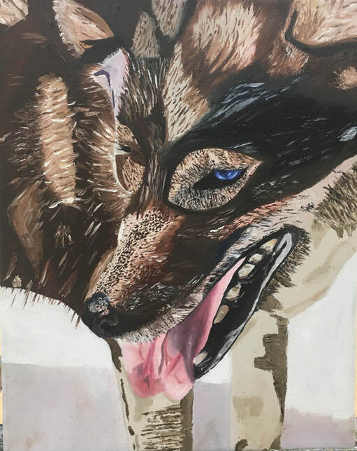 1. Overall, I think this painting is one of my best I've done so far. The eyes and mouth look the best! The tongue includes the shadows as appeared in the original photo and includes the different shades of pink/purple. The eyes do a good job of bringing life into the wolf and captivating a viewer. I like how I addd the white to the eye to brighten it up. The fur detailing could use some work given it is a bit messy. I could blend the contrasting colors some more to make the fur flow more easily. The values of brown I used are very similar to those in the painting. The darker brown was hard to create but I think I came close to what it looked like in the picture. The texture of the body could be done better by adding some more strokes to the empty spaces.
2. To accomplish value, I mixed white with shades of brown and matched it with where each shade seemed to be in the picture. Some areas of the wolf were black, some were dark brown, some were lighter brown, some were white. For the values of the tongue, I used the dark purple/magenta to create a shadow as shown in the original photo. The wolf has a lot of texture in various parts of its body. I used different sized brush strokes depending on how evident they were in the original picture. Some furs were very tiny in the actual wolf, so in the painting, I used tiny strokes to replicate the texture. If I added more strokes in the empty spaces I have, the wolf would look much better. Layering/blending was a vital part to make the wolf look as cohesive as possible. I didn't want each color patch to seem different. Layering and blending the different values helped create an appealing flow. The contrast was captivated by the many different brush strokes and the different patches of values. To me, the eyes and the mouth make the wolf appear realistic. Those two features did a good job of intimidating the way they appeared in the real photo. Therefore, I feel the eyes and mouth are the most important aesthetic quality of the portrait bringing life and realism into the painting. 3. The videos of how to create fur and the eyes helping. ed me a lot through my painting. With the fur, I used different shades of the same color and layered them over each other. With the eyes, I added highlights of white to brighten the blue and bring life to them. I also added black detailing as shown in the picture to the inside of the eye. For some parts, I decided not to fully smooth out the paint to keep texture in those places. 4. I feel I started off strong with this project but slowly became weaker with it. The mouth and eye were one of the first things I painted on the canvas and came out the strongest. However, the fur took so long to paint that I missed many spots on the body. I feel that my growth with techniques definitely improved. I feel more comfortable with the eyes of an animal. I also feel I improved with drawing in this project as well. At first, my drawing skills weren't proportional nor did they include all the details necessary. After being taught to fold the original photo and map out each part of it onto the canvas, my drawing came out better. 5. This painting probably took me the longest to create even thought it was the tiniest. I had to take it home to finish. I feel my craftsmanship was well done given this was my first portrait painting. It could definitely improve with more neat brush strokes and blending out the colors some more. However, I am proud of this painting overall and is better that I though I could have done. It is quite similar to the original picture which surprises me. The quality is pretty good given of how similar it appears to the actual wolf. Original Photo 2 Colored Sketches In-progress photos
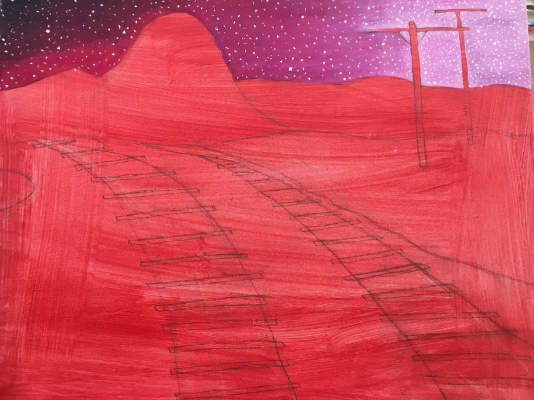
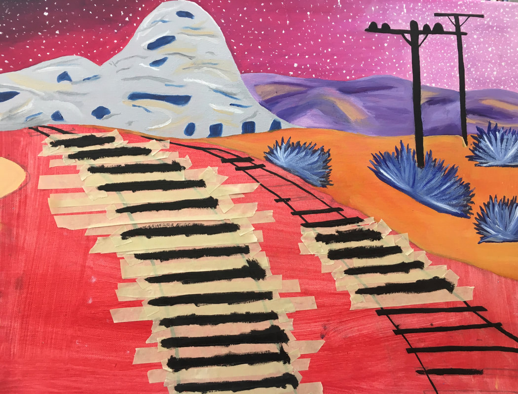
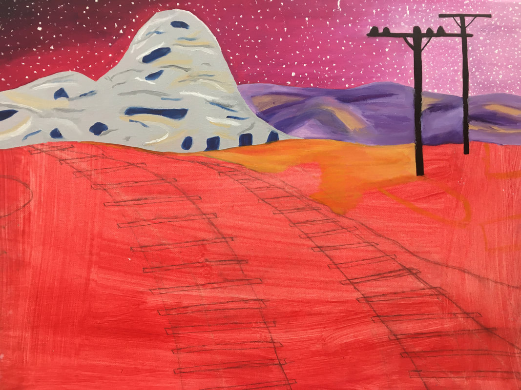
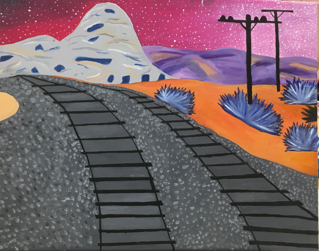
final painting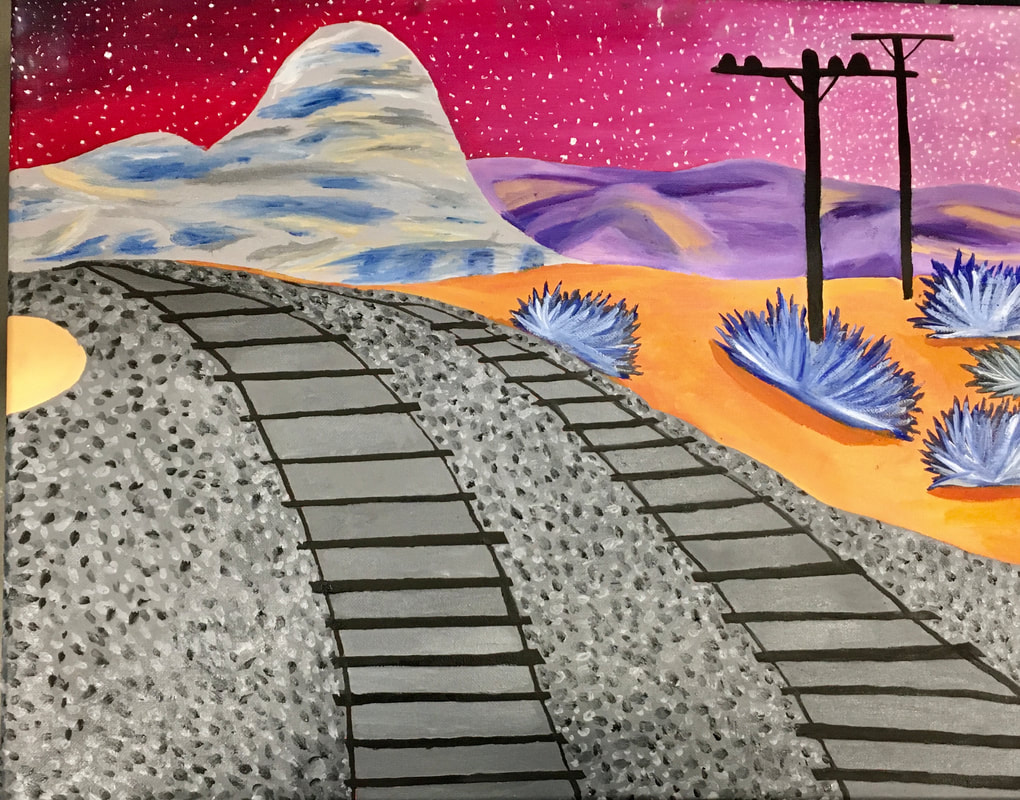 1. The craftsmanship of my painting is pretty good. Before adding texture to the gray mountains, I wouldn't have felt the same way I feel about it now. However, after blending the colors into the mountains, I feel the painting appears more cohesive. Overall, the painting is neat and clean however the railroad lines could be more straight.
2. My favorite part about my painting is the colors I chose to use. I chose to incorporate colors that are so far apart from each other but am happy with how they look together as a whole. I used vibrant colors throughout my painting given the vibrant blues and oranges incorporated in the real image. I included bright pinks, royal blues, vibrant oranges and deep purples. To make the colors come together, I added different shades of gray and black. 3. A lot of the contrast in my painting is done through colors. I feel the colors do most of the talking when talking about contrast given they are so different from each other. Also the contrast of textures adds to the effect. The blending through the mountains from the rocks near the railroads to the blue shrub all use different textures for contrast. 4. Adding a darker orange to the bottom of the shrubs creates a shadow so the shrubs don't appear as if they are floating. The highlights or lighter shades in the shrubs gives value as well as in the mountains. Adding texture to the mountains made them more realistic and gave them depth, The texture of the rocks was accomplished my dabbing a small brush with different values of grays. 5. I created depth to my painting by incorporating the same perspectives in the original photo to my painting. For the railroads, I made the railways horizontal lines so they seemed as they were getting further away as they got closer to the mountains. The perspective of the lights gave depth by having one placed further/smaller from the other one. Given the railroads are bigger than the section with the mountains, it adds perceptive to make the mountains seem like they are further away. 6. A painting technique that made my painting successful was the use of dry brush. This technique became important to blend colors together becoming more cohesive. It was an important technique in to create texture in the mountains. Another important technique was gradient which helped to create the pink skies. The gradient helped make the different values of pink come together easily. 7. One difficulty I had was creating the railroads. Painting them in a way that they would have depth was difficult for me to accomplish. I also had a hard time painting textures to the mountains so they looked natural. 8. Like I said before, the colors was a big part of making my painting successful. I think without the vibrant colors, the painting would be boring and bland. I really like the pink sky with the addition of white stars. I think the composition of the painting made it successful as well. I got lucky with the layout of the picture because it made the composition of the painting easier to form and appear natural.
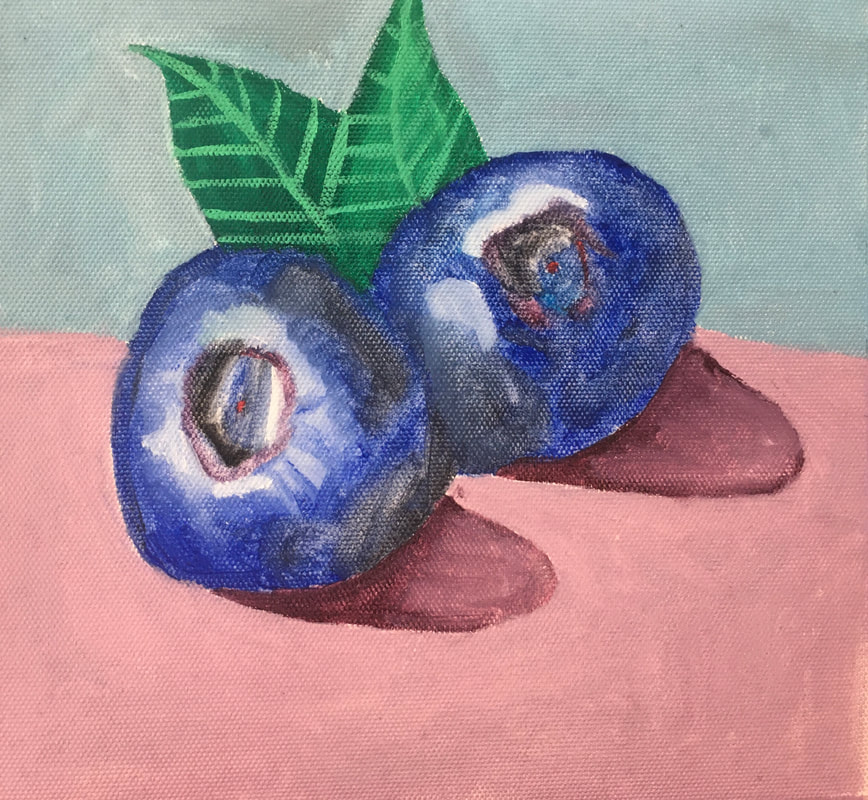
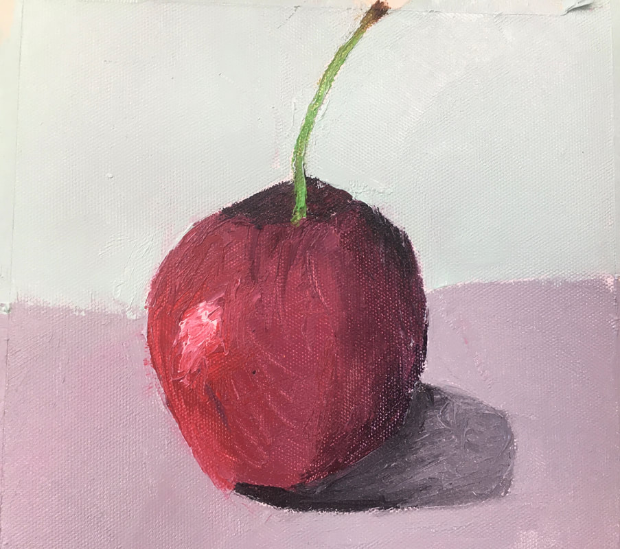
For this assignment, we had to use oil paint using brushes on one fruit. For the other fruit, we had to use oil paint using a palette knife. I used the palette knife to paint my cherry and the brushes for the blueberries. I actually like the cherry more than the blueberries. I thought the palette knife would be very difficult to use but it wasn't as hard as I expected dit to be. At first, it was hard to control but once I got used to it, the pallet knife became easier to manage. For the blueberries, I think they came out this way because I didn't blend the different values of blue together smoothly. For the leaf, I think I could have also done a better job smoothing out different values of green. Overall, I think I did a good job on this practice given it was my first time using oil paint.
Research
Reference Photos
6 Compositional Sketches
2 Colored Sketches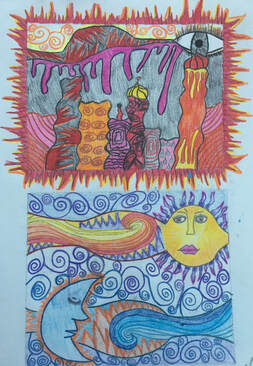 In Progress Pictures
Final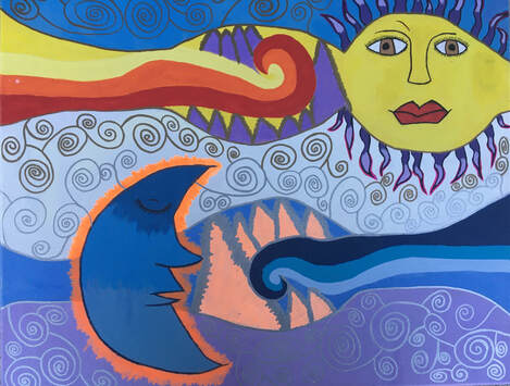 Critique Questions:
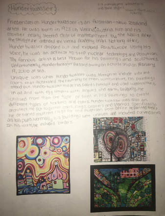
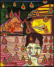
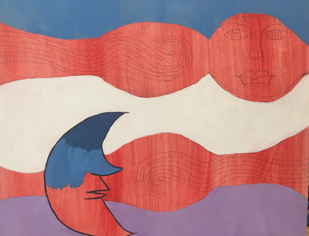
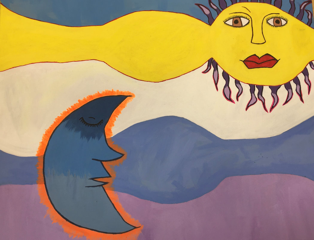
1. I think my craftsmanship of this painting was good but I definitely think I could have done better. With time constraint, I tried working as fast as possible to complete the painting on time and failed to keep precision on some parts. I feel that I took most of my time on the sun and moon so I wasn't able to take my time on the other patterns in the painting. 2. My artwork embodies Hundterwasser because I used his technique of swirls, and didn't use any straight lines. In one of Hundertwasser's paintings he had a face in the sky that faded out to the other side of the painting. I tried to embody this technique with the moon and the sun. My artwork embodies Klimt given I used gold and silver detailing to embellish my artwork like he did throughout his. 3. The color harmonies I chose to use was a combination of warm and cool colors. The top portion with the sun has mostly warm colors with bits of purple and gold. The bottom portion with the moon contains mostly cool colors with bits of silver and orange. I chose to add one cool color to the warm color combination and vice versa to make this piece look more cohesive. 4. I don't have one focal point in my artwork. I consider the sun and the moon both my focal points in this painting. Both the sun and moon are the first things someone will look at given they are the only realistic things in the paining while the rest are just patterns. 5. Other than paint, I used gold and silver sharpies to embellish my work. I used these sharpies to enhance certain patterns or create a metallic effect. Much of my painting is just patterns. It contains swirls, triangles, waves, curves and etc. The patterns help make the sun and the moon recognizable focal points. 6. I chose not to create a border for this painting because I felt the spirals already created the same effect as a border would. I did include borders into some of my other compositional sketches and my other colored sketch. However, I thought that border would be too much for this painting and would take away from the focal points so I chose not to include one. 7. Timing was definitely a difficult component for me in this artwork. I took my time when I first started the painting and didn't have enough time to do the same later on in the project. This was my first time doing an acrylic painting so I also thought it was hard creating the certain colors that I wanted to mimic. Also, I found it hard to create smooth and precise lines with acrylic paint especially tiny lines. Colored Sketch and Original Photo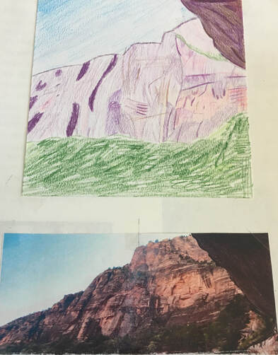 In-Progress Pictures
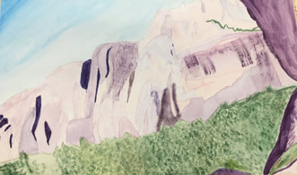
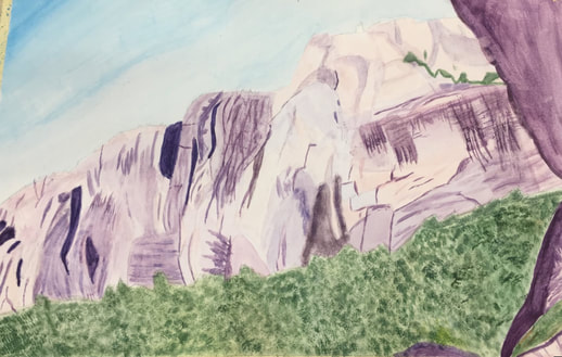 Final Painting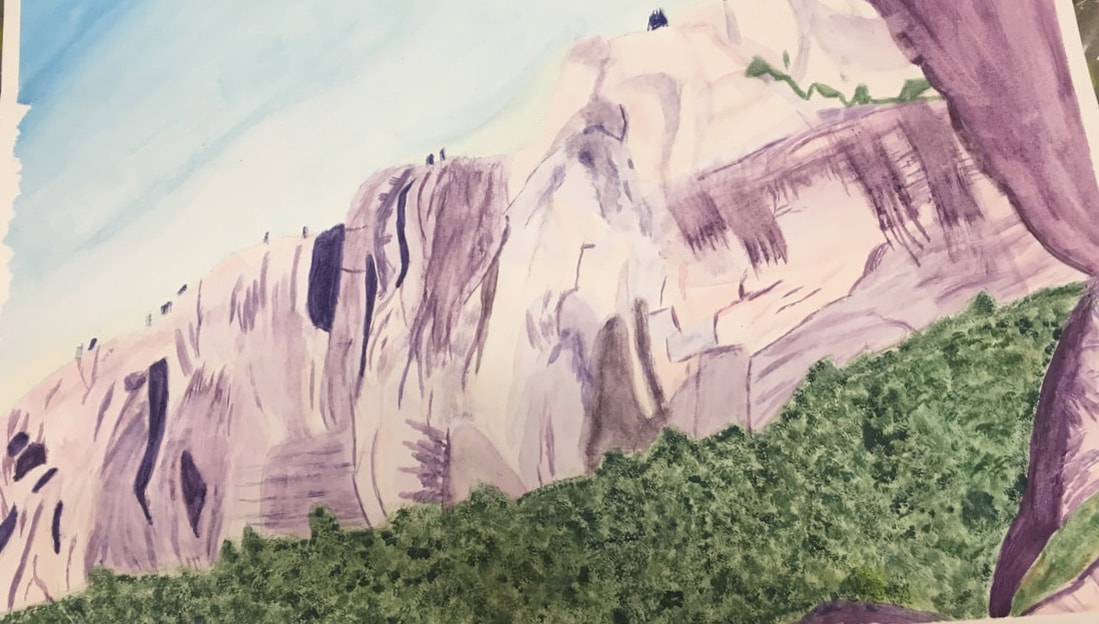 1. Dry-bush was a technique that I utilized often throughout my painting especially to create the details in the mountains. This was the technique that I thought was truly effective through my painting because it created the scatter of detailing that was demonstrated in the mountains. I also used gradient to create the sky given the outer edge was a deeper blue and as it came closer the mountains, became a lighter blue. This was effective because it illustrated the same effect as the sky in the original photo.
2. Using transparent layers was crucial in my painting. As shown in my first progress photo, the first layer is very light with little to no values. The only way to incorporate the tiny details into the mountains and the tress was if I painting transparent layers below it. Using transparent layers made it easier to build things up without making the painting look choppy. 3. I think my composition was successful because of my colored sketch. The colored sketch truly helped me make the layout of the painting realistic and proportional because I had a reference that I made to look at. I think I did use all of the elements of art except texture. Attempting to make things look as cohesive as possible, I think I used the elements of art and principles of art in order to do so. 4. Color choice was an important factor in the success of the painting because of the unique colors demonstrated in the photo. I found it difficult to make the mountains look like mountains with the purple in the photo. It was important to imitate the colors as realistic as they looked in the photo. 5. I think I did better on this painting then I thought I was going to do. This was my first time creating a piece of art by painting. I took a lot of time trying to mimic the tiny details in the mountains and into the trees as well. However, I tried using multiple different brushes and techniques to reciprocate the effects. 6. If I were to do something different, I think I would make the pink in my painting more vibrant and a deeper pink. Also, I think I would change the way I painted my trees. I would try using a different technique to make the trees appear more similar as to how they appeared in the picture. 7. I have learned a lot about watercolor. The last time I used watercolor was when I was a middleschooler painting in 6th grade. I have learned the many different techniques of watercolor and how to incorporate those techniques in creating a piece of art. This watercolor project improved my development of art by teaching me ways to take my time and to pay attention to close details. 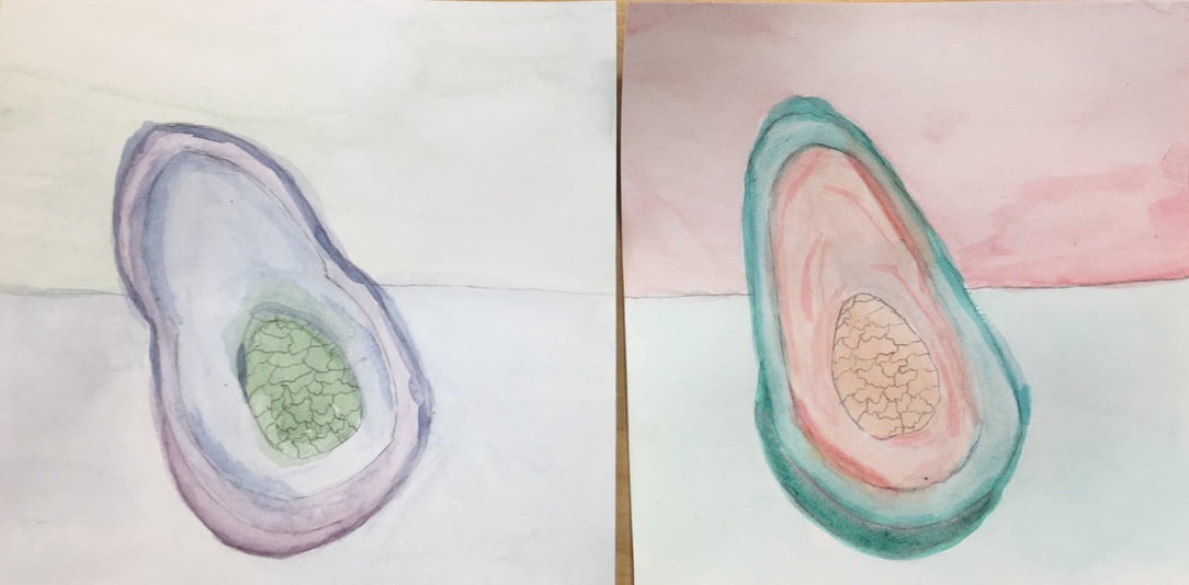
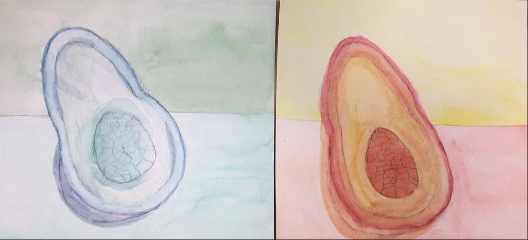 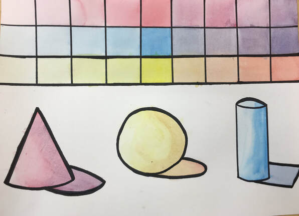 For the water color value chart, the purpose of this practice was to experiment creating value using water colors. To darken a shade, we used less water and to lighten a shade, we used more water. We also practiced creating shadows and visualizing a light source when painting. This went along with values because the parts of the shape that were being hit by the light source were lighter than the parts farthest from the light source. I think I did a good job with the lighter values and the shapes but I could work on creating the darker shades of a color. 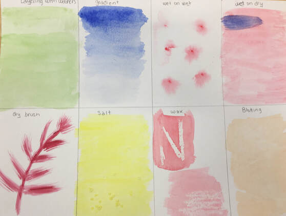 For the water color techniques, we practiced different methods with using watercolor. We learned ways to create different textures, styles, and looks. We tried 8 different techniques, including layering with washers, gradient, wet on wet, wet on dry, dry brush, salt, wax, and blotting. I did pretty good with this practice given it is easy to tell what each method is by viewing my attempt.
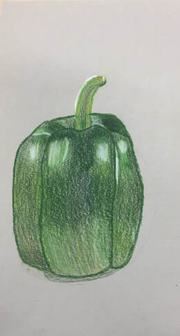
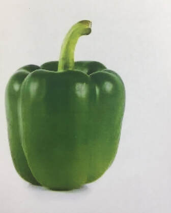
For this assignment, we were told to choose an image of a vegetable or fruit and create a realistic drawing using colored pencils to mimic the drawing. Using the colored pencils, we were told to create value. I think I did an okay job on my pepper. I think I did a good job o trying to add value however, I think I could have blended the colors more to make it look combined. Also, I drew the pepper more on the skinner side.
|